A Visualization with GGPlot2
For our grand finale we’ll be exploring the ggplot2 package to create some visualizations.
While ggplot2 is very popular, its best to think of it as the core to a cluster of
extensions. In fact, ggplot2 refers to itself as belonging to the tidyverse ecosystem.
You don’t need to know too much about that except that at its core, tidyverse is
committed to writing R packages with common APIs (ways of communicating with
functions) and a shared philosophy of how things should work. The benefit to you is
that typically everything in the ggplot2 ecosystem works pretty much the same
way so you don’t have to spend a lot of time learning how each function works.
Each ggplot2 plot starts with creating a ggplot() object. A ggplot() contains
data and an aesthetic (aes()) that describes how to use the data. Then you just
keep adding layers onto it with other functions to create your desired visualization.
This may sound complicated and foreign to you at first. However, with a little experience (and time spent wrestling wiht other graphics functions and packages that don’t work this way), most people come to see the elegance of using ggplot2.
To get started, lets do a very simple plot. First off we are going to see a third
way to get the mtcars data to generate nice labels. This time converting the
numeric categories into labeled factors.
mtcars$gear <- factor(mtcars$gear,levels=c(3,4,5),
                      labels=c("3gears","4gears","5gears"))
mtcars$am <- factor(mtcars$am,levels=c(0,1),
                    labels=c("Automatic","Manual"))
mtcars$cyl <- factor(mtcars$cyl,levels=c(4,6,8),
                     labels=c("4cyl","6cyl","8cyl"))
mtcars$vs <- factor(mtcars$vs, levels = c(0,1), labels = c("V-shaped", "Straight"))

View(mtcars)
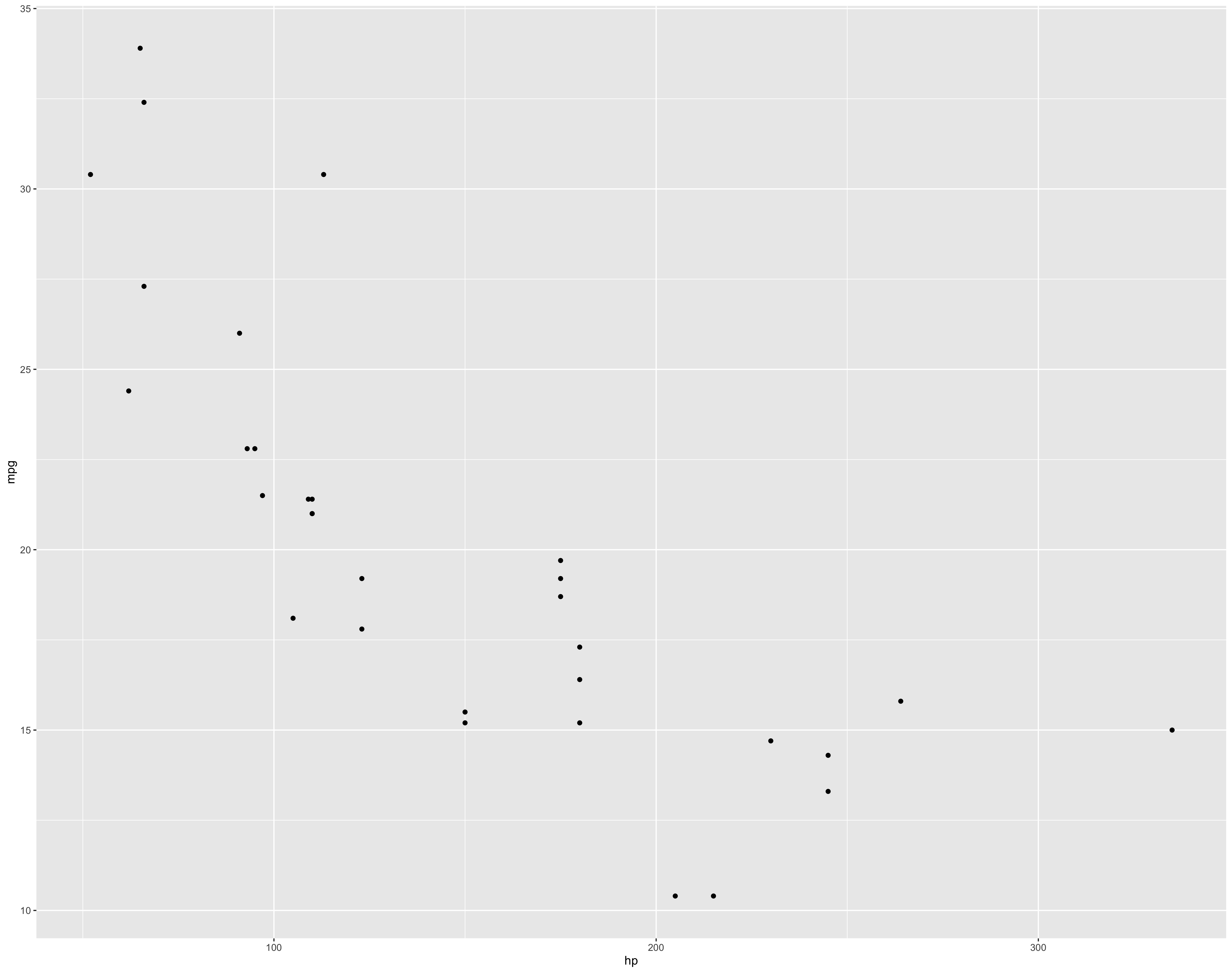
Then we’ll make our ggplot() object. Lets look at horsepower and mpg first.
> mt_plot <- ggplot(data = mtcars, aes(x=hp, y=mpg))
> mt_plot + geom_point()  # This tells ggplot to create a scatter point plot
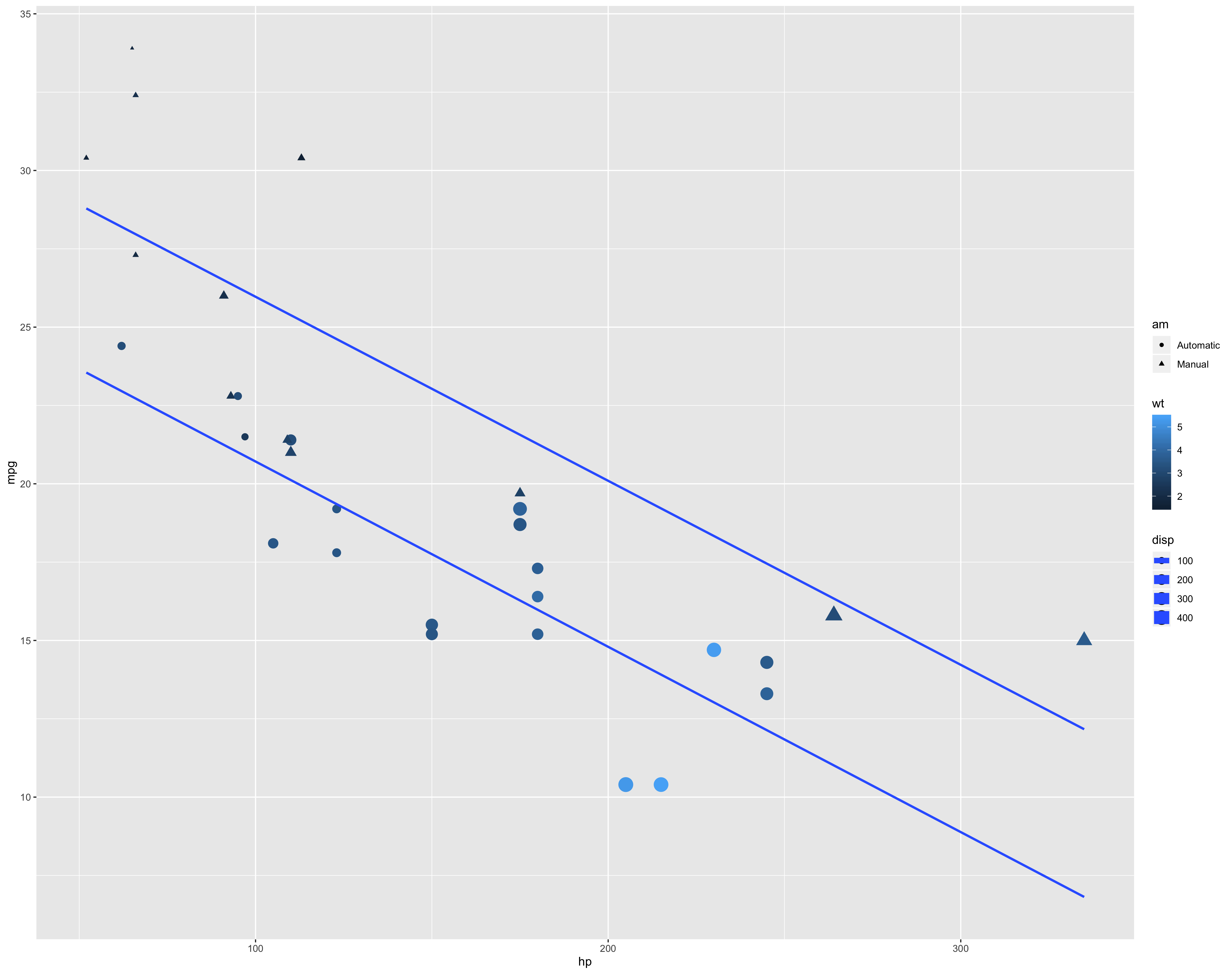
We can add more information into the graph. Lets make the size of the points dependedent on the Displacement, the shape of the point dependent on the transmission, and the color depend on the weight.
> mt_plot <- ggplot(data = mtcars, aes(x=hp, y=mpg, size = disp, shape = am, color = wt))
> mt_plot <- geom_point()   # This add geom_point() to the plot
> mt_plot   # This displays the plot
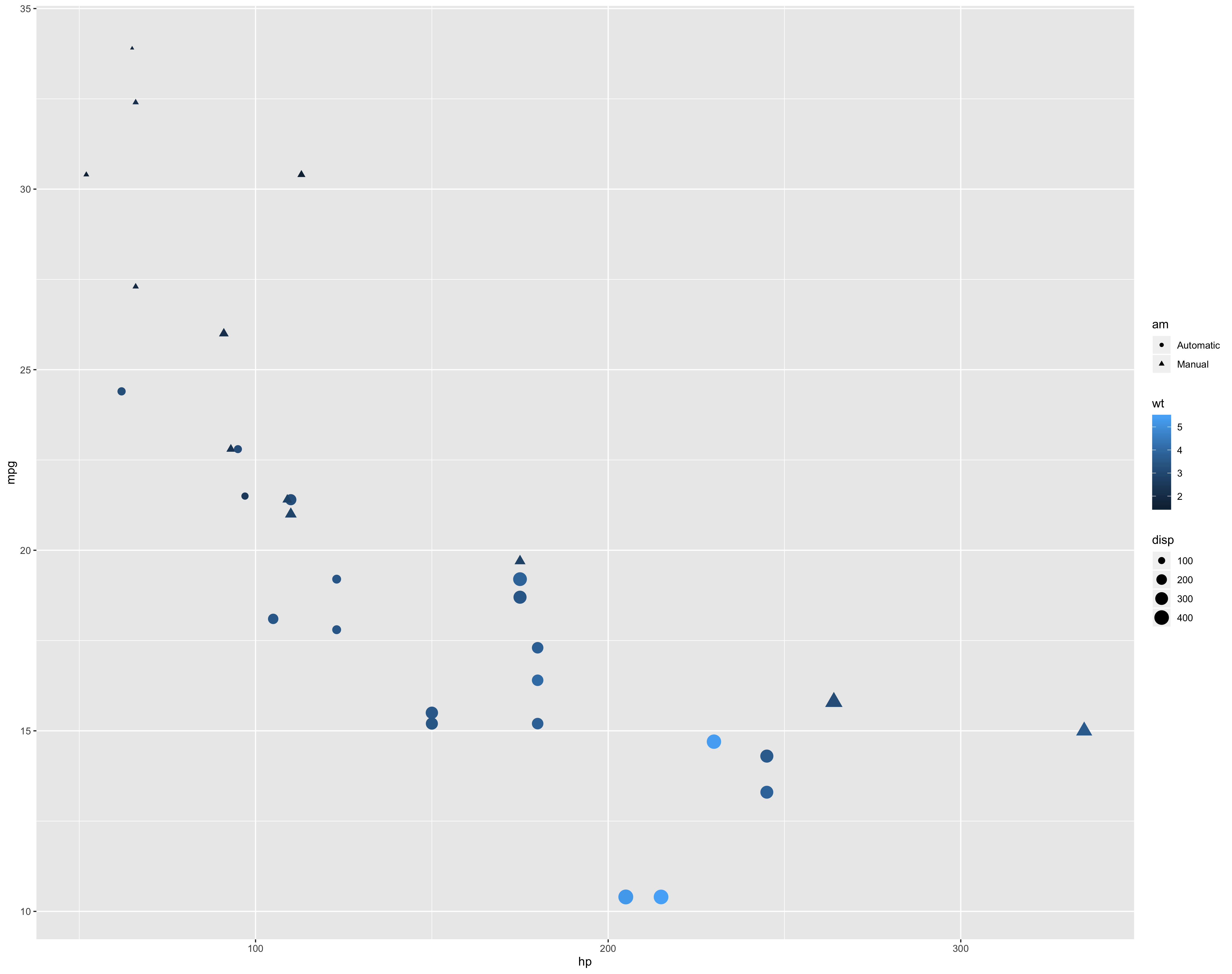
Notice ggplot2 does a lot for you, such as adding legends, and automically scaling the size of the points. You can override those defaults as well.
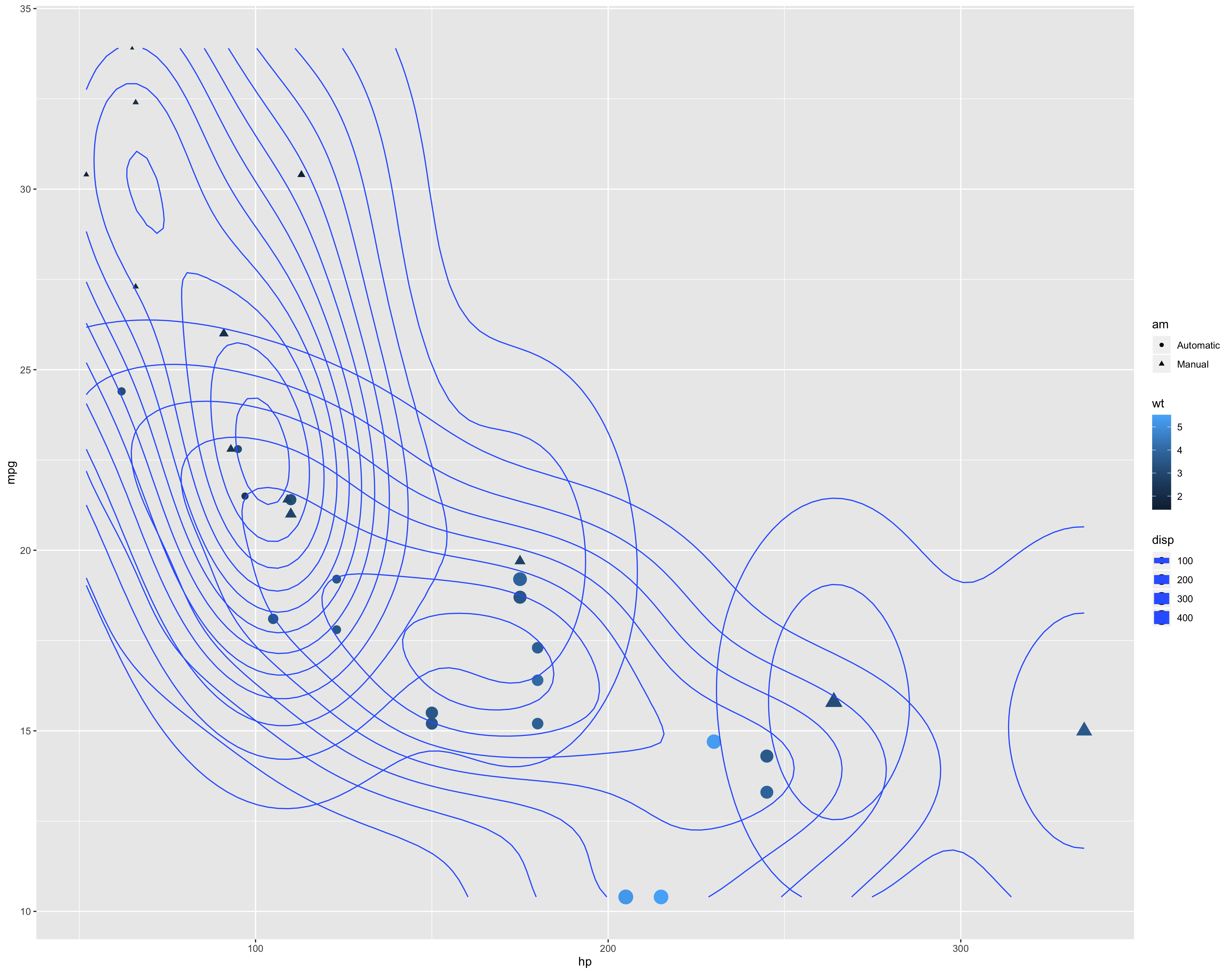
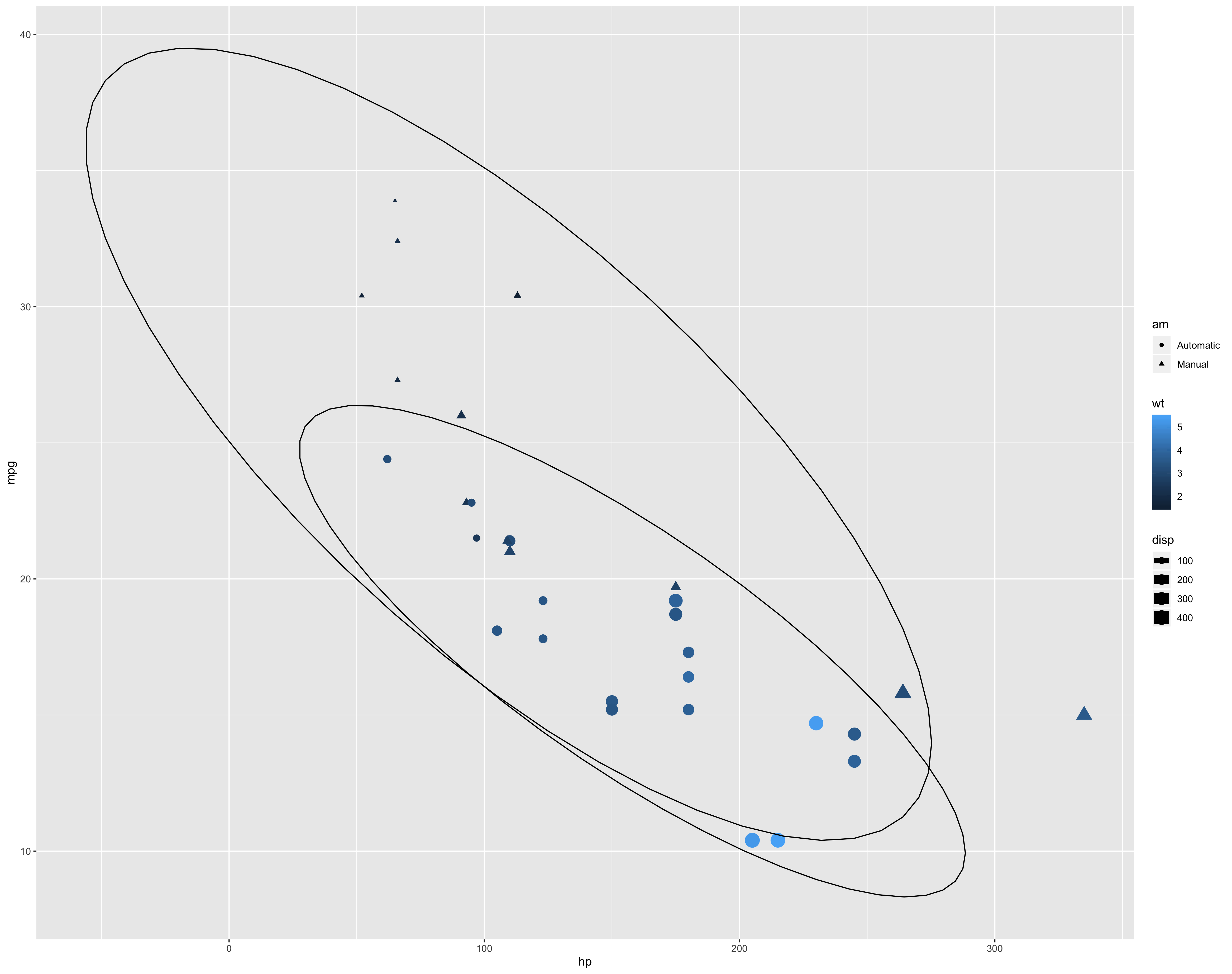
You can keep adding additional layers, given that they work with your aesthetic. Essentially each geom_x, theme_x or stat_x will refine or change the existing plot. However, not everything will work so it can take some trial and error along with some searching on the web. The next chart doesn’t really seem to add much, but its a good example of adding geoms to a plot.
> mt_plot + geom_density_2d()

> mt_plot + stat_ellipse()
Fitting lines to the plot is often helpful.
> mt_plot <- mt_plot + geom_smooth(method = lm, se = FALSE)
> mt_plot
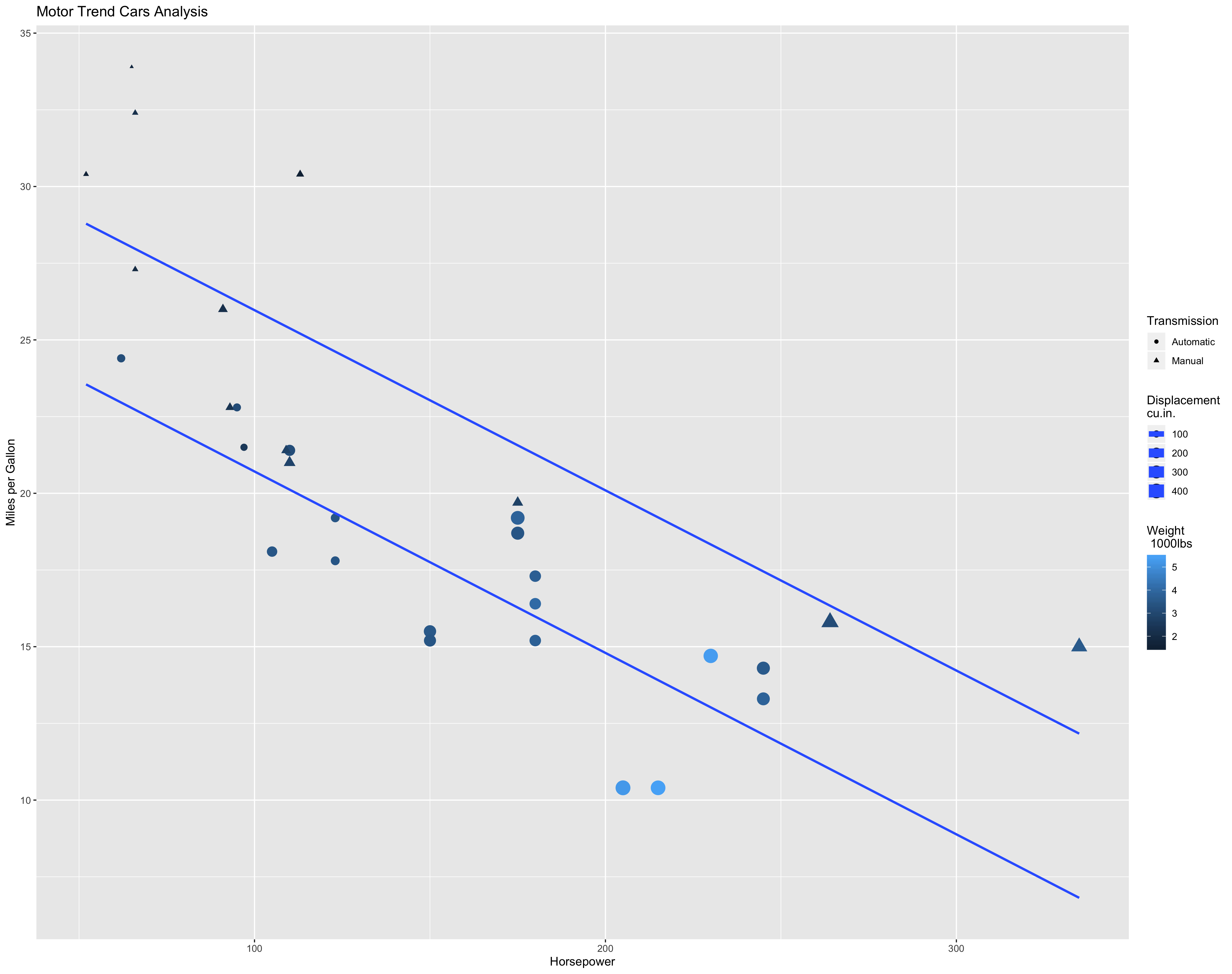
Once we get the content how we like it we can address more stylistic issues. First lets do labels and titles.
# Notice the indenting to make it easier to read and edit. This is a common style,
# there are others too. The most important thing is to be consistent.
> mt_plot <- mt_plot + scale_colour_gradient("Weight \n 1000lbs") +
                       scale_shape("Transmission") +
                       scale_size_continuous("Displacement\ncu.in.") +
                       scale_x_continuous("Horsepower") +
                       scale_y_continuous("Miles per Gallon") +
                       ggtitle("Motor Trend Cars Analysis")
> mt_plot
We can also use some themes with ggthemes. If it isn’t installed and loaded do so
first. This package has some preset themes that can probably make your chart cleaner
and more stylish. Below are some you can try.
> mt_plot + theme_classic()
> mt_plot + theme_tufte()
> mt_plot + theme_clean()
> mt_plot + theme_economist()
> mt_plot + theme_fivethirtyeight()
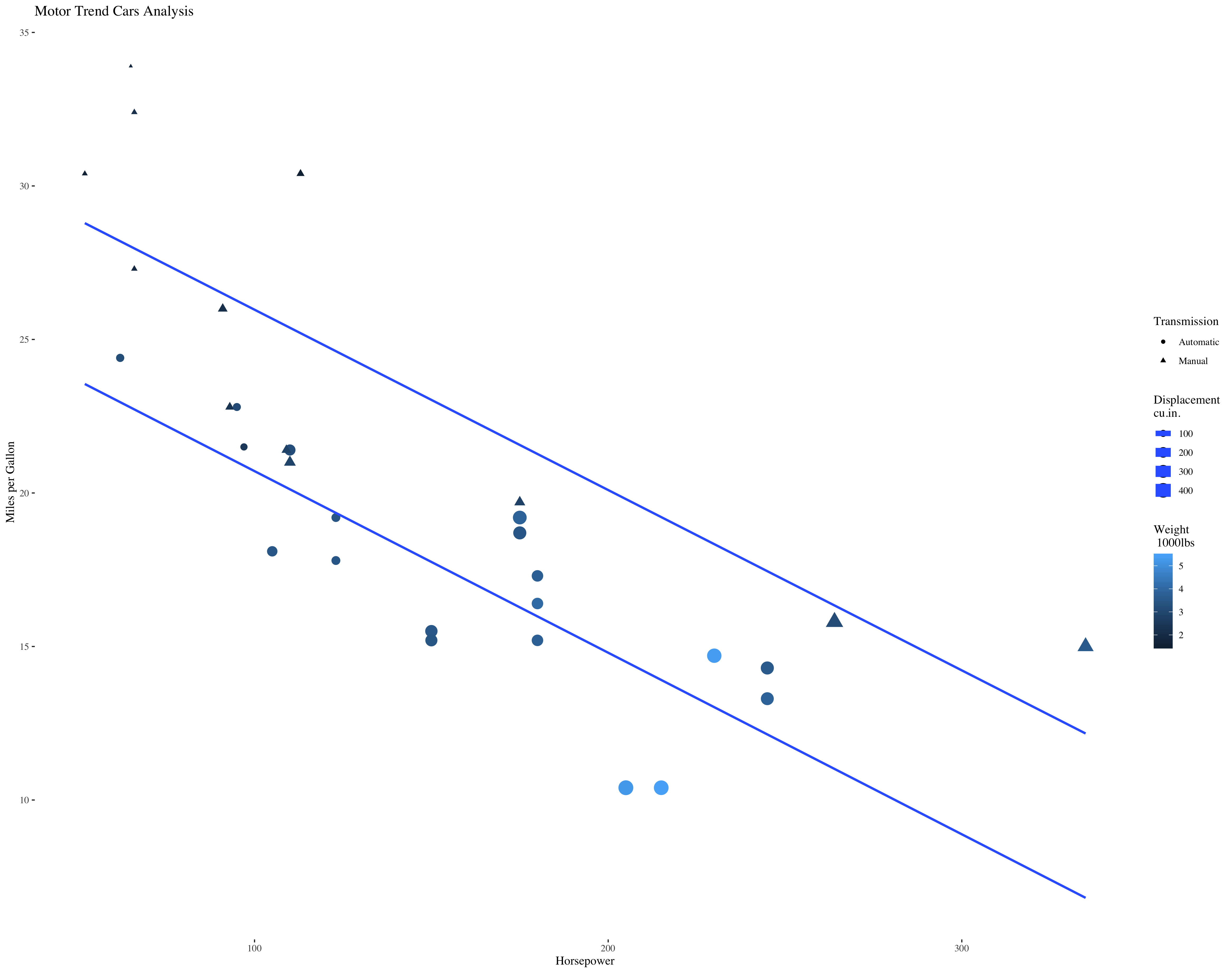
> mt_plot <- mt_plot + theme_tufte()
> mt_plot
The tufte theme is derived from some classic books and thinking by Edward Tufte. His general philosophy is that your visualizations should have the minimal amount of ink to convey the story your graphic is trying tell. Anything else should be eliminated. As you can see below, a lot of what we might normally see in a graph is eliminated.
Now that we have the plot we want we can save it.
ggsave("my_final_plot.png")
Try It Out
Explore creating other graphics in ggplot2. Perhaps use the state.x77 data. Use
the reference page on the ggplot2 website to try out other geoms and other
layers.
Page 8 of 9