First Visualization
The analyses introduced in the previous unit are a critical part of a study, but presenting the text from a statistical output is a confusing and unattractive way to present the results to a reader. One option is to pick out the salient parts of the output and just put them in text. For instance we could write…
Manual transmission cars achieved 7.2 mpg higher gas mileage than automatic transmission cars (manual = 24.4 mpg, automatic = 17.1 mpg, t = 5.4939, df = 29.234, p < 0.05 ).
This is frequently done, especially if this result isn’t really the most meaningful result of your study. However, if you want your result to have more impact on the reader, and make the result clearer and more appealling its better to create a visualization. Here, we will start simply and build up a little bit to a more complex visualization exploring some of the many options that come with R’s visualization functions.
The first step in creating any visualization is to decide how to present the data. Two
options come to mind, a bar chart, or a box plot. How to make these decisions is beyond
this tutorial. Briefly, the boxplot works better when we want to also display the distribution
around a median. Bar charts are usually more appropriate for count data. There are
other options as well, but we’ll go with a box plot. Start with looking at the
documentation for a boxplot help("boxplot"). Graphics in R have a lot of options.
A good approach is to start with the most basic and gradually build up. It is also
a good idea to look at the examples in the documentation as well. Also, don’t be
afraid to try the web, search “R box plot” and you will get many tutorials and
examples.
PRO TIP: In any kind of programming, spending a few minutes (OR MORE!) searching for examples of what you want to do can save a great deal of time in the future.
boxplot(mpg~am, data = mtcars)
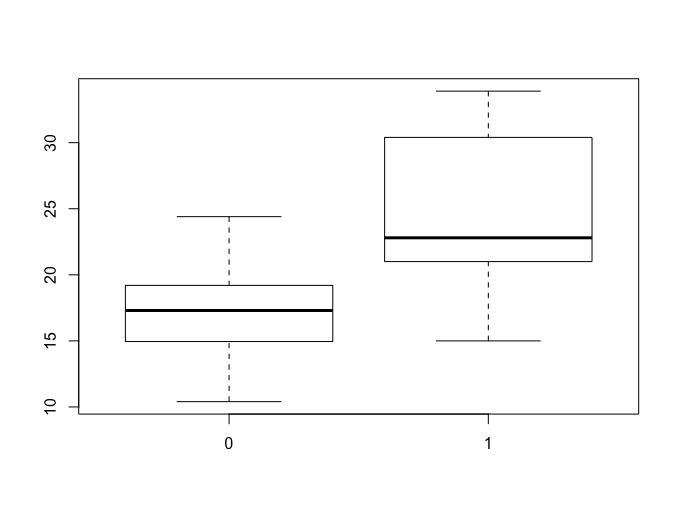
The box plot in Figure 1 is a good start, but there is a lot we can add. For instance, typicaly a graph should have a title, and labelled axes. Also, using 0 and 1 to denote transmission type isn’t very clear to let’s fix that too.
NOTE: This solution was pulled from a stack overflow question
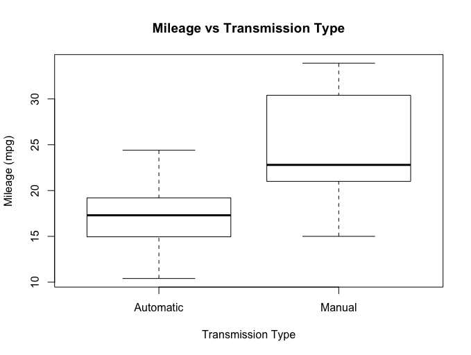
> boxplot(mpg~am, data = mtcars,
+                 xaxt="n",           # This supresses the x-axis values
+                 main = "Mileage vs Transmission Type",
+                 xlab = "Transmission Type",
+                 ylab = "Mileage (mpg)")
> axis(1, at=(1:2), labels = c("Automatic", "Manual"))  # Adds the new x-axis lavels
Try It Out
Read about some of the options for boxplots help(boxplot). Try some of them out, for instance **notch = **
and **boxwex = **. Some of these may take some trial and error or not even work so well.
That is OK!
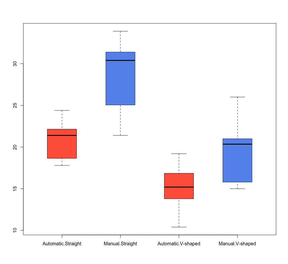
Adding a Little Color
Colors can add a lot of meaning to a visualization. They can also be abused too! We’ll do a little of both to demonstrate applying color to your visualizaitons. One useful reference is this chart of named R colors
Also added here is a little data recoding done to demonstrate another way to get good axis value labels. There is a fair amount going on here, so take some time and walk through the steps.
four_colors = c("tomato", "cornflowerblue", "mediumseagreen", "lightsalmon2")
two_colors = four_colors[1:2]

# We are selecting and assigning words to the cryptic numbers.
mtcars$engine_type[mtcars$vs == 0] <- "V-shaped"
mtcars$engine_type[mtcars$vs == 1] <- "Straight"
mtcars$transmission[mtcars$am == 0] <- "Automatic"
mtcars$transmission[mtcars$am == 1] <- "Manual"

boxplot(mpg~transmission*engine_type, data = mtcars, col = two_colors, boxwex = 0.5)
Try It Out
- Substitute
four_colorsfortwo_colors, what happens? - What other modifications would you make to this chart?
Page 5 of 9